Tuesday, 11 November 2014

Still a star after 3500 years


Go ahead, ask me "What it is the most beautiful, poetic and desirable object among the 50 works of gold on view in The Queen's Gallery at Buckingham Palace?" Because I want to pipe up with my answer: It is a cup, not teeny, but small enough to rest in your palm--or mine as I began to imagine it as soon as I saw it. A powerful, mellow even modern design but made circa 1700 b.c. Still a star after 3500 years. Don't think this show (on until February 29), lacks more immediately eye- catching pieces. In fact I didn't notice the Rillaton Cup right away. For one thing it is at the far end of the large, long gallery. For another there was a hard to decipher object up close--maybe it was a comb but maybe it was an instrument for making music. 

Above: The Rillaton Cup    


Neither turned out to be right. It is a flat beaten crown with a plume that stands straight up--like stylized feathers. It is also exceedingly rare. The piece was dug up in Ecuador in 1854 and given by the country's president to Queen Victoria. Until recently it was assumed to be Inca but recent research suggests it was made well before the Inca's conquered south Ecuador in the 16th century. Bold but not something to hold attention or anyway mine. My eyes wandered. They were caught by a tiger. 

Pre-Inca Crown

This gold cat (below) was made in India in the 18th century from sheets of gold placed over a wood base. It was then etched and punched with designs that suggest fur but also battle scars. The latter were altogether appropriate..
Tiger's head from the throne of Tipu Sultan. Royal Collection Trust / Her Majesty Queen Elizabeth II 2014
Tiger head from Tipu Sultan's throne

Smaller, jewelled, images of tiger heads decorated the throne. (One is currently on view at the Metropolitan Museum in New York in a show of jewels owned by the Emir of Qatar.) This big guy was the throne's centerpiece.
   Tipu Sultan who ruled the kingdom of Mysore was opposed to the British presence in the subcontinent. He played the French against them as he tried to extend his realm. During the Fourth Battle of Mysore, British troops broke through their defences. It is believed he could have escaped but chose not to. "One day of life as a Tiger is far better than thousand years of living as a Jackal," is his alleged comment when that was proposed. He was killed. 
  This tiger, with its fierce yet thoughtful and magnificently decorated face survives. Part of the throne on which sat an ambitious, warrior Sultan who lived to die as a tiger became war booty and entered the English Royal Collection where it is proudly displayed today.  His tongue sticks out and moves--the better to make people approaching the Sultan feel more nervous. Today, alas, it makes it look more like a clever, luxurious toy. And then I saw the cup. Here is its story:
  
In 1837, men working at Rillaton on windy, bleak Bodmin Moor in Cornwall helped themselves to some stones piled up in an ancient burial mound. They uncovered a ceramic vessel inside which was this Bronze Age treasure. The land belonged to the Duchy of Cornwall--the Crown. The treasure belonged to the King and off it went to the palace.  Lucky us--it is on long term loan to the British Museum where all can see it when this show ends.                                                                                                             


Art and Soul at the National Gallery

Tuesday, 30 September 2014

Vote No: Keep Freud's Auerbachs in London

A great show; an Arts Council blunder.


Never mind all the guff about how collections tell us a lot about the collectors who have made them. Usually they do not. Often a collection doesn't even add to our appreciation or understanding of the individual works that make it up. But exceptionally, when a collector has a good eye and is in sympathy with what he is acquiring, the results can be powerful and illuminating. And so it is with the 40 works by Frank Auerbach owned by Lucian Freud at the time of his death in 2011. The paintings and drawings (and birthday cards) are temporarily on view at Tate Britain. Go see it if you possibly can. It is the best Auerbach retrospective London has known. You will have to hurry. The show closes November 9, After that Freud's Auerbachs are to be broken up; the collection dispersed. What a mistake!


Frank Auerbach (b.1931) Rebuilding the Empire Cinema, Leicester Square 1962 © Frank Auerbach
Rebuilding the Empire Cinema, Leicester Square
1962
Freud (b.1922) and Auerbach (b.1931), both child-refugees from Nazi Germany, grew up to ambitious artists not lacking in competitiveness. They spent their working lives in London. Even such a vast metropolis can be too small for some artists to share but these two men became close friends.

Birthday card from Frank Auerbach to Lucian Freud


They exchanged paintings but Freud also bought Auerbachs. He built a collection of works dating from the 1950s through to 2007. Following Freud's death, this collection was accepted by the Arts Council which administers the in lieu scheme. As a result, the death duties owed by Freud's heirs have been substantially reduced and museums around the country will be given works by Auerbach works. If Freud's was a so-so collection the idea would be fine. But it is revelatory; a delight. The Arts Council has made a huge mistake. 
Yes, it ticks the box "We are not elitist" and no, it does not tick the box, "London gets all the goodies," So the Arts Council has been politically correct. It has also been artistically blind .   
  
  The Tate already owns (or has on loan) 77 works by Auerbach. Why not chose 40 of these and distribute those around the country and KEEP FREUD'S AUERBACHS TOGETHER AT TATE BRITAIN IN LONDON. Public appreciation or Auerbach's on- going achievements will soar and Freud will be lauded for his not always appreciated generosity of spirit and his good eye. Visitor numbers to Tate Britain will rise. Go for it Arts Council. Admit you got it wrong and make it right.


Saturday, 13 September 2014

Dead or Alive, England's greatest artist

Joseph Mallord William Turner ‘Snow Storm - Steam-Boat off a Harbour’s Mouth’, exhibited 1842


Don't miss Late Turner: Painting Set Free at Tate Britain if you can get to London.  I felt like crying from start to finish and not from grief but from the wonder of what a great artist can do--and did  In case this does not translate well:
Joseph Mallord William Turner ‘The Steamer’, after c.1830
James Mallord William Turner, baptised in St. Paul's, in Covent Garden, died in 1851. He was 76 and had never lost his Cockney accent. There is nothing rough and tumble; nothing- in- your- face "Don't mistake me for a refined man"  about these works of his last 10 years on earth. They are the most thrilling, poetic, sometimes disturbing, pictures created by an Englishman. Before --or since.
    Some artists--DeKooning more recently and Picasso before him-- lose power in their last years. Not Turner. His late pictures could not seem more fresh nor more daring. So many are seemingly abstract or very nearly yet always the oils and watercolours seem to have been observed with exquisite attention to detail. The water shown in the painting of a storm at sea at the top of this post has the lush density and soft sheen of sheared fur. You look and understand that water alive; it can cause mayhem even death or be transporting to ride upon or gaze at.  There visions of pastoral paradise, too.  If ever there was a case where less is more, JMW Turner makes it exquistely.
Norham Castle, Sunrise c.1845, Joseph Mallord William Turner, 1775-1851

Sunday, 6 July 2014

Taught to know nothing

A multicolored blank tablet


When I was a school girl grammar was out. In my art student days, teachers gave critiques and otherwise kept out of the way. For decades before and after, art students were taught to be ignoramuses--at least about technique. I say "taught" because if something this basic is not on the curriculum, it is natural to assume it should not be; that it is not necessary.  At university, I took art history because I thought it would be an easy A. It turned out to mean hours shut in a dark room looking at slides. This was followed by the requirement to memorize names, dates, genres and categories; a nightmare. No wonder so many art historian/curators are unimaginative and uninspired; so many of their exhibitions corral paintings into the only categories they had been told existed or "adventurously" mix up the categories, a.k.a. juxtapose. (This is not entirely fair, but almost.) So much for background.

  
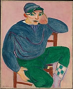
 If the world of visual artists--and we who look at their work--can be divided into those for whom line is central and the others for whom color is the heart of the matter, I have always been in the color camp.   Matisse is my man;Young Sailor II I love much of Picasso but when I look at his paintings I often feel that they were conceived in black, white and shades of gray and then colored up.  . 
  

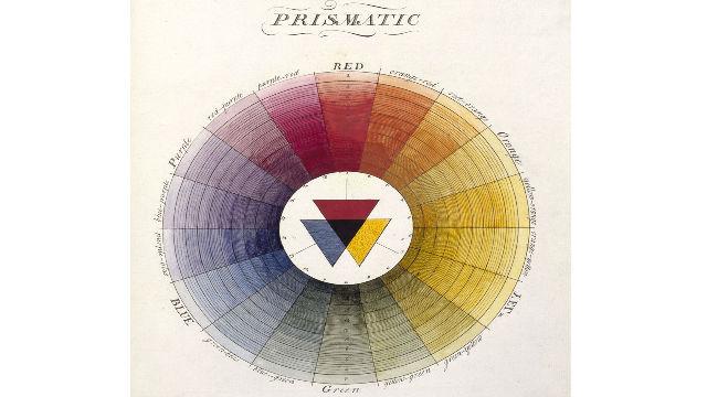
 Yet for all my passion for color, I never got beyond its ABCs—the stuff about how yellow and blue make green and what the various complements are. You can learn a lot, nearly everything, by listening and looking, experimenting and practicing. I could have educated myself about color as I tried teach myself about so many others things but somehow I was skittish; scared. It embarrasses me to have been so long ignorant of artists’ techniques; at the same time it is probably one of the most normal things about me.

Then I was sent the book [the subject of my previous post] which has been published to coincide with “Making Colour,” the National Gallery’s current exhibition (on view until September 7). I read and reread it. When the show opened, I was there to look and learn from Degas and all his reds and all the others whose colors light up those subterranean exhibition rooms.  

 Combing the Hair ('La Coiffure')

“Making Colour” is a revelation. It also teeters on the brink of fun. What would have pushed it over that edge? A workshop annex off to one side where I could have sat down with pigments mixed with different mediums—oil, gouache, tempera, water color, glazes and a variety of painting surfaces on which to dab them and see the results. A kindergarten for grown ups.  What could be more basic, more enjoyable and more eye opening? I'm ready. Where can I sign up?.

Saturday, 14 June 2014

Artful Dodgers: Painters and their colourful tricks

“In order to tell the truth you have to make things up.” Fiction writers crank out this truism so often it as all the revelatory impact of a fortune- cookie message. Worse yet, huffing and puffing will blow it away. This is one cliché that has no roots in the fertile soil of fact. Yet when an artist uses paint rather than words, it is essential. Consider this, one of many possible examples:


The Adoration of the Magi
The Adoration of the Magi  Giotto di Bondoni, circa 1320
 The thin sheets of gold leaf that Byzantine artists applied to the surface of their pictures look more artificial than the illusion of gold created by later artists using yellow and white pigments mixed with oil.
 As Leon Battista Alberti observed in his fifteenth century treatise “On Painting,” (Della Pictura), when gold leaf is used “some planes shine where they ought to be dark and are dark where they ought to be light.”

Portrait of Jan Pranger  by Frans van der Mijn 1742


 To successful create the illusion of a plausible three dimensional world on a two dimensional surface requires the deployment of quite a bag of tricks not least among them the manipulation of colour.  And yet:                                   
When people stand in front of a work of art and talk about how an artist uses colour they almost always sound pompous, so know-it-all ---and so beside the point—that my ears shut down and my legs move me away. Maybe for me this is because colour is the most important aspect of a picture; more important than line. In reading about technique, when colour comes up my reaction has always been much as it was when I was in tenth grade and Lettie Lee Craig tried to teach us algebra. Blind panic.  It wasn’t lack of interest exactly: As a graduate student in physiological psychology, I specialised in visual perception—how the brain and eye communicate, and the results. But about how artists use colour to create the colours I look at in the work, I remained ignorant and helpless to do anything about it. I am happy, even excited, to use the past tense. I’ve just finished reading “Colour.” It has been a revelation. Big applause and much gratitude to its authors, David Bomford of the Getty and Ashok Roy at London’s National Gallery. This small book (it is less than 100 pages) is the latest in the NG’s “A Closer Look” series. (Others have been about such topics as Angels, Allegory and Frames.) “Colour,” is clear and logical with many useful illustrations from the gallery’s collection used as examples, yet it is also lively and engaging, it doesn’t pack too much into a paragraph. It gave me time to take in an idea—like Alberti’s about the supremacy of paint over actual gold to create a believable image of gold—before going on.  Now the use of glazes makes sense. I understand the connection between Venice's position as a key trading post made pigments available to local painters like Veronese and Titian which were hard to get--or prohibitively expensive--to those elsewhere. And so much more. If you have had any of the kinds of gaps I regret having had, you will learn a lot too.

The publication of “Colour” is pegged to the National Gallery exhibition “Making Colour,” which opens June 18.  I'll be there and post.
  By the way: The illustrations here come from the Metropolitan and the Rijksmuseum. The National Gallery's images don't seem to want to join in with cut and past. 

Friday, 30 May 2014

An application for a non-existent job,or, Dear Tom Campbell


Dear Thomas P. Campbell, Emily Rafferty and readers of Art Darts,

This is an application for a position that does not exist from someone who wishes to have it in fantasy, only.
   I want to be writer-in-residence at the Metropolitan Museum of Art. After all, the best way to see art is to live with it. There are other reasons, also.
   When I was recently in New York from London for five days and overwhelmed by all I wanted to see in the museum, could not and--when it comes to special exhibitions like the Roof Garden--now never will.  I did see the Charles James show--the best fashion exhibition I've ever seen. Fantastical gowns were a treat but what made me visit three times in my short stay were the video screens with deconstructions of the patterns, the way the patterns were cut and then the reconstruction; rebuilding, of these architectural monuments to gorgeous and luxury.

The Clover Leaf Dress
Charles James Clover Leaf ball gown
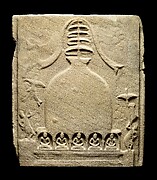
Then there was Lost Kingdoms. (About which I have written for ASR, Anne Summers Reports. It should be up on line next week.I'll tweet.) Curator John Guy's ambitious, revelatory survey of the early religious art of the firth to ninth century kingdoms that later become the nation-states of Southeast Asia. There was far too much to take in during my two visits, one of which included the curator's gallery tour. A real art historical adventure story with so much new and unfamiliar that it requires time to take hold in these eyes and this brain. And I kept wanting to see these examples of first millennium Hindu and Buddhist Indian influences sculpture alongside what had already been created in India and the Buddhist sculpture of China of the same era. Lost Kingdoms is an amazing feat--it cost a lot of money; required exceptional loans. The show I imagined would have required removal of a floor of the permanent collection and a hefty benefaction from Bill Gates or equivalent.

Khin Ba Relic Chamber Cover
Khin Ba Relic Chamber Cover  6th Century from what is now Myanmar.

A month at the Met would give me time to get a grip on these two shows and then there is so much more.
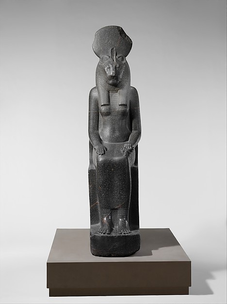
The Savoy Hotel has a writer- in- residence. But I would not demand room service. I'd have a picnic basket for dinner. I am a well trained litter picker upper. Or maybe the mail room would accept Pret deliveries. And if I got cabin fever--some cabin--I could take a bike ride through Central Park. (I feel sure the Met would let me keep my bicycle in the underground parking lot at the back.) It would be good to see the Temple of Dendur from outside as well as from my sleeping bag, assuming I'd be allowed a night camping in its shadow. Truth is I'd rather camp at the feet of Sekhmet but she, is nearby.Statue of the Goddess Sakhmet
    It happens that much as I like dreaming, I am also practical, even often realistic. If this job did exist, I would not be at the top of the list of those asked to fill it. But as I already said I would have to refuse even if asked. The wrinkle, for me, is this: I would not want to feel obliged to produce a single word for publication or perusal. Seeing and drifting are what I want to do. Spending an hour with Tiepolo (either father or son) and then heading for China or vice versa.  But productivity is the measure applied by others and that I could not--and would not want to--guarantee. Still, by moving in, if only in my imagination while writing this job application, I keep thinking of new works of art I'd like to go to sleep near and others I'd like to see first thing when I wake up in the morning. In my eyes I begin to see some of the so- big collection in a new way. I recommend it. And this way, you avoid the crowds.